Optimizing All Assets
One of the most powerful, but under-utilized ways to significantly improve performance starts with understanding hwo the browser analyzes and serves assets. It turns out that browsers are pretty great at discovering resources while parsing and determing their priority of the fly. Here’s where the critical Request comes in:
A request is critical if it contains assets that are necessary to render the content within the users’ viewport.
For most sites, it’d be HTML, necessary CSS, a logo, a web font and maybe an image.
We can control this behavior by carefully picking critical resources and adjusting theri priority.
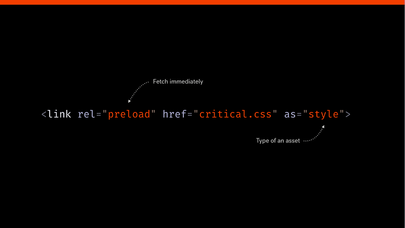
preload
With <link red='preload'> we are able to manually force assets’ priority to High ensuring that desired content will be rendered on time.
This technique can yield significant improvements in Time to Interactive metric, making optimal user experience possible.
Critical requests still seem like a black box for many, and the lack of sharable materials doesn’t help to change that.jj
Optimizing Images
Images often account for most of a web page’s transferred payload.
Choosing the right format
The initial choice falls between vector and raster graphics:
Vector: resolution independent, usually significantly smaller in size. Perfect for logos, iconography and simple assets comprising of basic shapes.
Raster: offers much more detailed results, ideal for photographs.
After making this decision, there are a fair bit of formats to choose from: JPEG, GIF, PNG-8, PNG-24 or newest formats such as WEBP or JPEG-XR, JPEG-2000.
JPEG: Imagery with many color(e.g. photos)
PNG-8: Imagery with a few color
PNG-24: Imagery with partial transparency
GIF: Animated imagery
Experimenting with new formats
WebP is easily the most popular contender, supporting both lossless and lossy compression, which makes it incredibly versatile. Lossless WebP is 26% smaller than PNGs and 25-34% smaller than JPGs. With 74% browser support it can safely be used with fallback. JPGs and PNGs can be converted to WebP in PS and other image processing app as well as through command line interface(brew install webp).
Responsible and responsive Imagery
W’re perfectly equipped to do so with picture element and srcset attribute(both have 85% support)
The srcset attribute
srcset works best in the resolution switching scenario – when we want to display imagery based on user’s screen density and size. Baseed on a set of predefined rules in srcset and size attributes the browser will pick the best image to serve accordingly to the viewport.
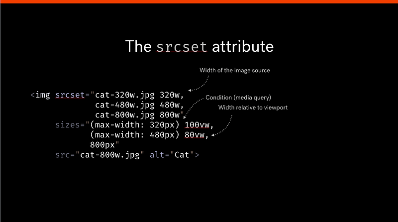
1 | <img |
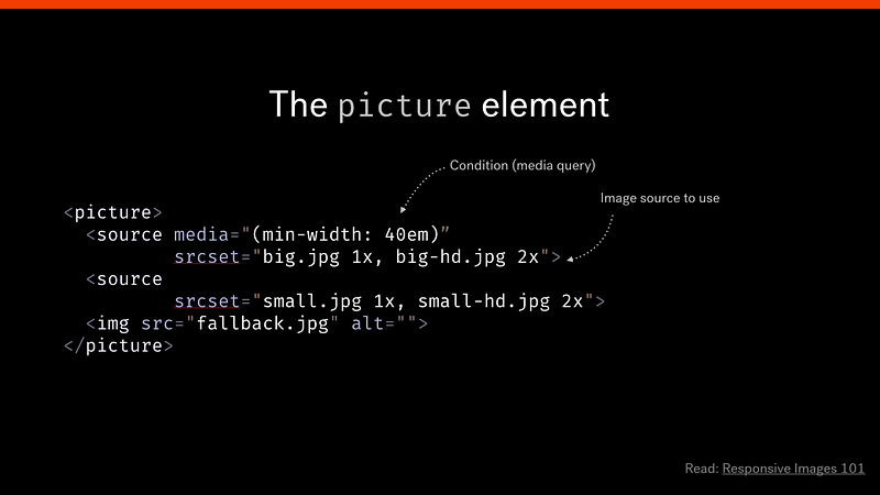
The picture element
picture element and the media attribute are designed to make art direction easy. BY providing different sources for varying conditions.
Delivery with image CNDs
Optimizing Web Fonts
Choose the right format
There are four web font formats: EOT, TTF, WOFF and WOFF2.
TTF and WOFF are most widely adopted, boasting over 90% browser support. Depending on the support you’re targeting it’s most likely safe to server WOFF2 and fall back to WOFF for older browsers. The advantage of using WOFF2 is a set of custom preprocessing and compression algorithms resulting in approx 30% file-size reduction and impoved parsing capabilities.
When defining the sources of web fonts in @font-face use the format() hint to specify which format should be utilized.
use Unicode-range subsetting
Establish a font loading strategy
Fonts are render-blocking – because the browser has to build both the DOM and CSSOM first. Wdb fonts won’t be downloaded before they’re used in a CSS selector that matches an existing node. This behavior significantly delays text rendering, often causing the Flash of Invisible Text(FOIT).
Implementing a font strategy prevents users from not being able to access your content.
font-display is a new CSS property providing a non-javascript reliant solution.
1 | @font-face { |
