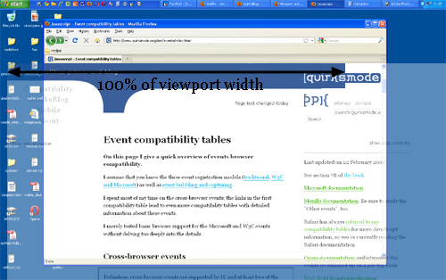
vw(viewport width) and vh(viewport height) are legnth units that represent exactly 1% of the size of any given viewport, regardless of its measurements. rem(short for root em) is also similar in its functionality, although it deals specifically with font sizes, and derives its name from the value fo the font size of the root element – which should default to 16 pixels on most browsers.
There are also a few more viewport units available for use, such as vmin and vmax which refer respectively to 1% of the viewport’s smaller dimension, and 1% of its larger dimension.
Interestingly enough, browsers actually calculate the entire browser window when it comes to width, meaning they factor the scrollbar into this dimension. Should you attempt to set the width of an element to a value of 100vw, it would force a horizontal bar to appear, since you’d be lightly stretching your viewport.
Device Pixels and CSS Pixels
Device Pixels are the kind of pixels we intuitively assume to be ‘right’. These pixels give the formal resolution of whichever device you’re working on, and can be read out from screen.width/height.
If you give a certain element a width: 128px, and your monitor is 1024px wide, and you maximize your browser screen, the element would fit out on your monitor eight times.
If the user zooms, however, this calculation is going to change. If the user zooms to 200%, your element with width: 128px will fit only four times on this 1024px wide monitor.
Zooming as implemented in modern browsers consists of nothing more than ‘stretching up’ pixels. That is, the width of the elemtn is not changed from 128 to 256px, instead the actual pixels are doubled in size. Formally, the element still has width of 128 CSS pixels, even though it happens to take the space of 256px.
In other words, zooming to 200% makes one css pixels grow to four times the size of one device pixels(two times the width, two times the height)
A few images will clarify the concept. Here are four pixels on 100% zoom level. Here CSS px fully overlap with device px.
Let’s zoom out. The CSS pixels start to shrink, meaning that one device px now overlaps several CSS px.
If you zoom in, the opposite happens. The CSS px start to grow, and now one CSS px overlap several device px.
The point is that you are only interested in CSS px. It’s those px that dictate how your style sheet is rendered.
Device px are almost entirely useless to you.
At zoom level 100% one CSS px is exactly equal to Device px.
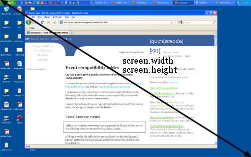
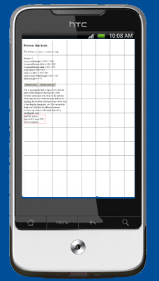
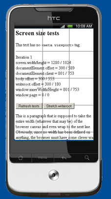
Screen Size
screen.width and screen.height means the total width width and height of the user’s screen. These dimensions are measured in device px because they never change: they’re feature of the monitor and not of the browser.
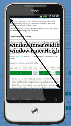
Window Size
window.innerWidth and window.innerHeight
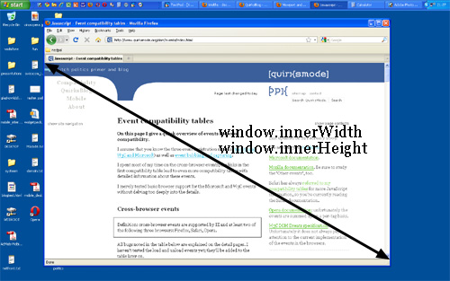
Window Size is measured in CSS px.
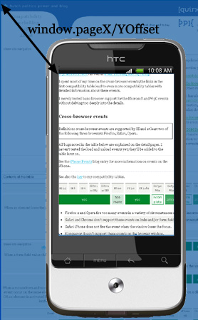
Scrolling Offset
window.pageXOffset and window.pageYOffset contains the horizontal and vertical scrolling offsets of the document. Thus you can find out how much the user has scrolled.
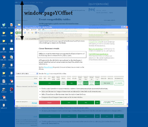
These properties measured in CSS px.
Viewport
The function of the viewport is to constrain the element, which is the uppermost containing block of your site.
Suppose you have a liquid layout and one of your sidebar has width: 10%. Now the sidebar neatly grows and shrinks as your resize the browser window. How does it work.
Technically, what happens is that the sidebar gets 10% of the width of its parent. Let’s say the . Normally all block-level element take 100% of the width of their parent ().
So your sidebar get width of 10% of browser.
In theory, the width of the element is restricted by the width of the viewport. The element takes 100% of the width of that viewport.
The viewport, in turn, is exactly equal to the browser window: it’s been defined as such. The viewport is not an HTML construct, so you cannot influence it by CSS. It just has the width and height of the browser window – on desktop. On mobile it’s quite a bit more complicated.
White width: 100% works fine at 100% zoom, if we zoomed in the viewport has become smaller than the total width of the site, the content will spills out of the element, but that element has overflow: visible, which means that the spilled-out content will be show in any case.
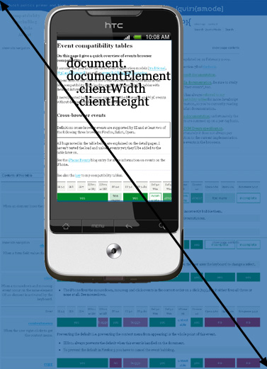
Measuring the viewport
The Viewport size can be found in document.documentElement.clientHeight and document.documentElement.clientWidth
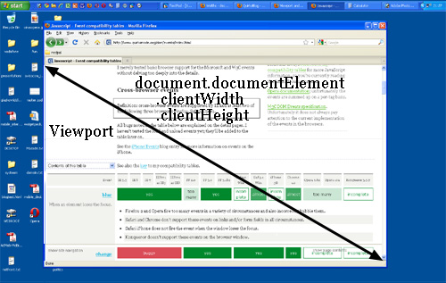
If you know your DOM, you know that document.documentElement is in fact the <html> element: the root element of any HTML document. However, the viewport is one level higher, so to speak, it’s the element that contains the <html> element. That matters if you give the <html> element a width.
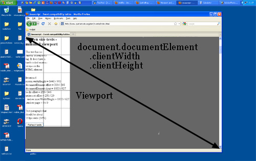
So document.documentElement.clientWidth and document.documentElement.clientHeight always give the viewport dimensions, regardless of the dimensions of the <html> element.
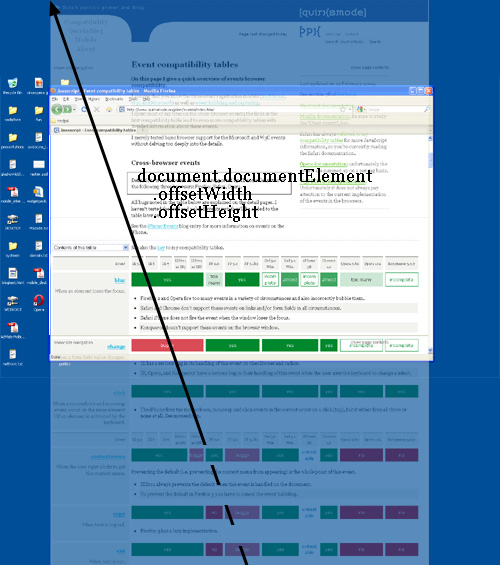
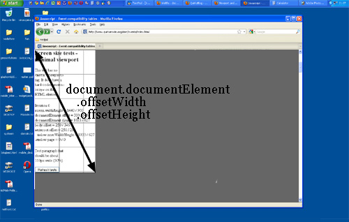
Measuring the element
document.documentElement.offsetWidth and document.documentElement.offsetHeight will give size.
Event coordinates
There are the event coordinates. When a mouse event occurs, no less than five property pairs are exposed to give you information abou the exact place of the event. For our discussion three of them are important:
pageX/pageYgives the coordinates relative to the<html>element in CSS px.clientX/Ygives the coordinates relative to the viewport in CSS px.screenX/Ygives the coordinate relative to the screen in DEVICE px.
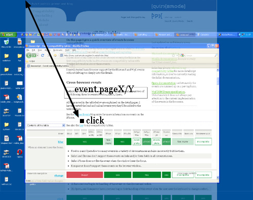
You’ll use pageX/Y 90% of the time. Usually you want to know the event position relative to the document.
The other 10% of the time you’ll use clientX/Y
You never ever need to know the event coordiantes relative to the screen.
Media queries
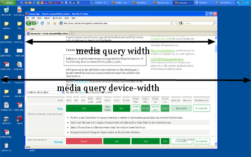
There are two relavant media queries: width/height and device-width/device-height
width/heightuses the same values asdocument.Element.clientWidth/clientHeight, namely the viewport, it works with CSS px.device-width/device-heightuses the same values asscreen.width/heightwith device px.
The problem of mobile browser
Let’s go back to our sidebar with width:10%, if mobile browsers would do exactly the same as desktop browser, they’d make the element about 40px (if the device-width is 400px). and that’s too narrow. Your liquid layout would look horribly squashed.
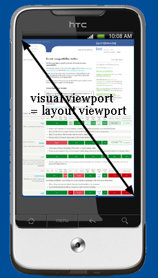
Two viewports
The viewport is too narrow to serve as a basis for your CSS layout. The obvious solution is to make the viewport wider. That however requires it to be split into two: the visual viewport and the layout viewport.
A simple explanation at StackOverFlow:
Imagine the layout viewport as being a large image which does not change size or shape. Now image you have a smaller frame through which you look at the large image. The small frame is surrounded by opaque material which obscures your view of all but a portion of the large image. The portion of the large image that you can see through the frame is the visual port. You can back away from the large image while holding your frame(zoom out) to see the entire image at once, or you can move closer(zoom in) to see only a portion. You can also change the orientation of the frame, but the size and shape of the large image (layout viewport) never changes.
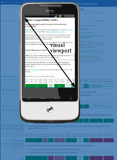
The visual viewport is the part of the page that’s currently shown on-screen.
The user may scroll to change the part of the page he sees, or zoom to change the size of the visual viewport.
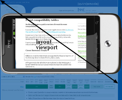
However, the CSS layout, especially percentual widths, are calculated relative to the layout viewport, which is considerably wider than the visual viewport.
Thus the <html> element tabkes the width of the layout viewport initially, and your CSS is interpreted as if the screen were significantly wider than the phone screen. This makes sure that your site’s layout behaves as it does on a desktop browser.
How wide is the layout viewport? That differs per browser.
Safari uses 980px
Opera uses 850px
Android 800px
IE 974px
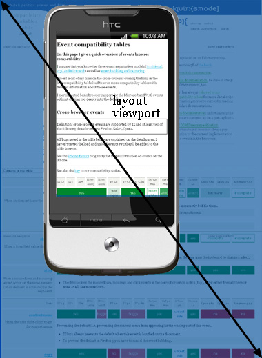
Understanding the layout viewport
In order to understand the size of the layout viewport we have to take a look at what happens when the page if fully zoomed out. Many mobile browsers initially show any page in fully zoomed-out mode.
The point is: browser have chosen their dimensions of the layout viewport such that it completely covers the screen if fully zoomed-out mode(equal to the visual viewport)
Thus the width and the height of the layout viewport are equal to whatever can be shown on the screen in the maximally zoomed-out mode. When the user zooms in these dimensions stay the same.
The layout viewport width is always the same, if you rotate your phone, the visual viewport changes, but the browser adapts to this new orientation by zooming in slightly so that the layout viewport is again as wide as the visual viewport.
This has consequences for the layout viewport’s height, which is now substantially less than in portrait mode. But web developers don’t care about the height, only about the width.
Measuring the layout viewport
document.documentElement.clientWidth and document.documentElement.clientHeight contain the layout viewport’s dimensions.
The orientation matters for the height, but not for the width.
Measuring the visual viewport
As to the visual viewport, it is measured by window.innerWidth/innerHeight. Obviously the measurements change when the user zooms out or in, since more or fewer CSS px fit into the screen.
The Screen
As on desktop, screen.width/height gives the screen size, in device pixels. As on the desktop, you never need this information as a web developer.
Visual viewport position relative to Layout viewport
html element
Just as on desktop, document.documentElemetn.offsetWidth/offsetHeight gives the total size of the <html> element in CSS px.
Meta Viewport
1 | <meta name="viewport" content="width=320"> |
It is meant to resize the layout viewport.
Suppose you build a simple page and give your elemnet no width. Now they stretch up to take 100% of the width of the layout viewport. Most browsers zoom out to show the entire layout viewport on the screen, giving an effect like this
All user will immediately zoom in, which works, but most browsers keep the width of the elements intact, whcih makes the text hard to read.
Now what you can try is setting html {width: 320px} then
When you set
1 | <meta name="viewport" content="width=320"> |
You set the width of the layout viewport to 320px.
Of course now we use
1 | <meta name="viewport" content="width=device-width"> |
to adapt to various browsers.