Benefits of CSS 3
- CSS3 Transitions are natively handled by the browser, which means they are always faster than a comparable JS animation.
- JS animation is more difficult.
Bezier Timing Functions
CSS3 has a transition-timing-function property which accepts keywords like ease, ease-in, and linear.
However we can define our own timing function using a cubic-bezier value. It sounds and looks complicated but can be explained with some simple diagrams.
linearcurse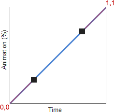
ease-in-outcurse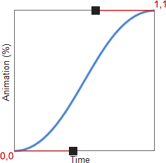
it starts slowly, about 12% of the animation is completed in the first 25% of time;
it ends slowly, about 12 % of the animation is completed in the last 25% of time
What’s a Bezier Curve

Since the animation line starts at (0, 0) and ends at (1, 1), we just need to define the points P0 and P1 in the cubic bezier value, e.g.
cubic-bezier(p0x, p0y, p1x, p1y);
transition-timing-function: cubic-bezier(0.25, 0.25, 0.75, 0.75) //linear
transition-timing-function: cubic-bezier(0.42,0,0.58,1) //ease-in-out
`</pre>

<pre>`transition-timing-function: cubic-bezier(0.5, -0.5, 0.5, 1.5) // invalid, points cannot locate outsite (0,1)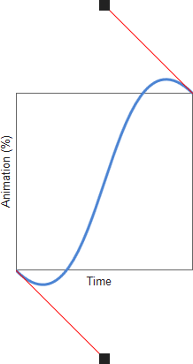
Let the Tools do the Work
Transition Property Basics
Which CSS Properties can be animated?
- width
- padding
- color
- top
- border-radius
- transform
- all
you can set one or more to property transition-property