Setting up and configuring the Axes
Change the text size
The default size is 10px with the font type of sans-serif.
There are a couple of different ways that we could change the font size and either one is valid.
The first way is to specify the font as a style when drawing an individual axis.
1 | svg.append('g') |
There are a few things to notice here.
Firstly, we do indeed have a larger font and it appears to be of the type ‘times’.
Secondly, the y axis has remained as 10px sans-serif.
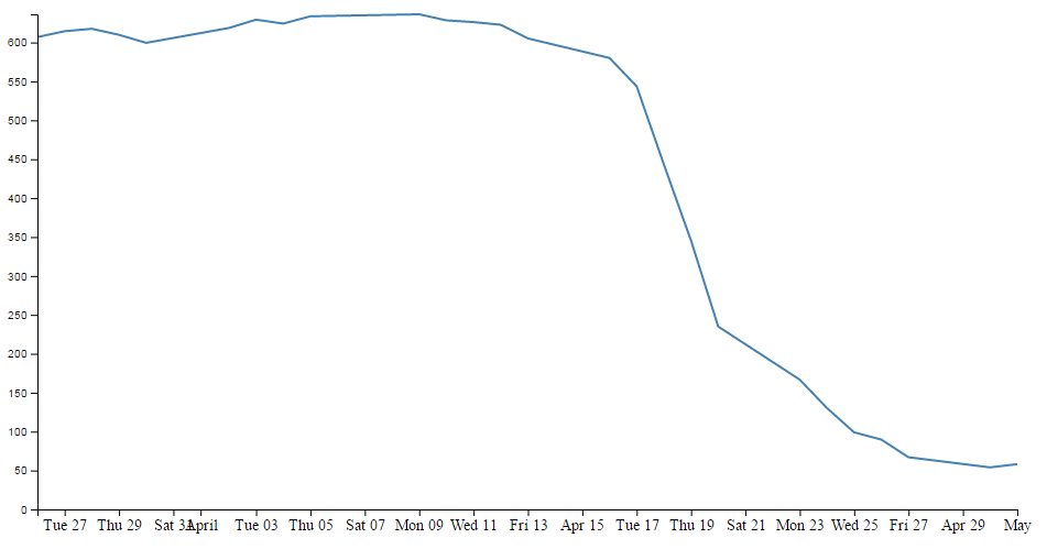
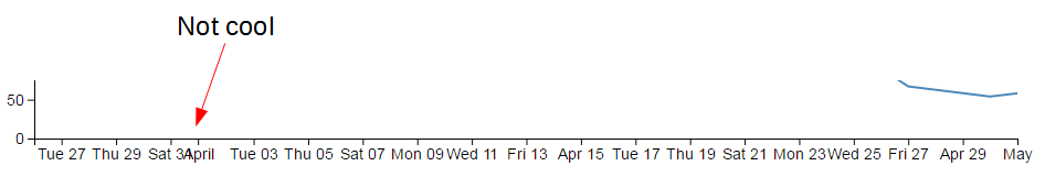
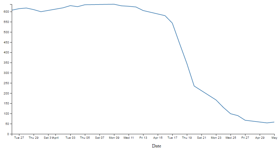
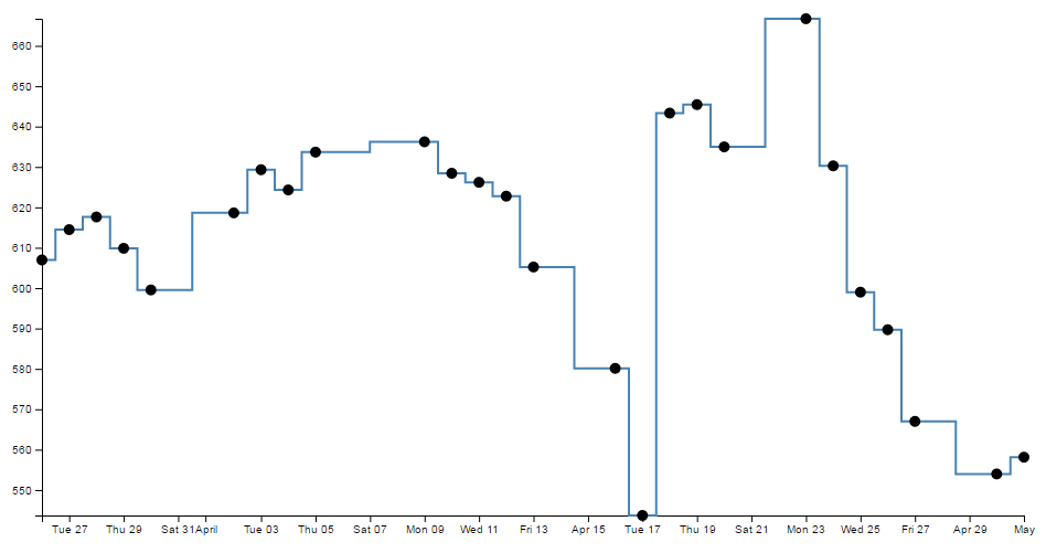
Lastly, the number of values represented on the x axis has meant that with the increase in font size there is some overlapping going on
By this way, you can change stype of x axis while leaving y axis away.
But if you want to change two axis meanwhile, you’d better use class.
Change the number of ticks on an axis
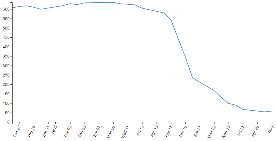
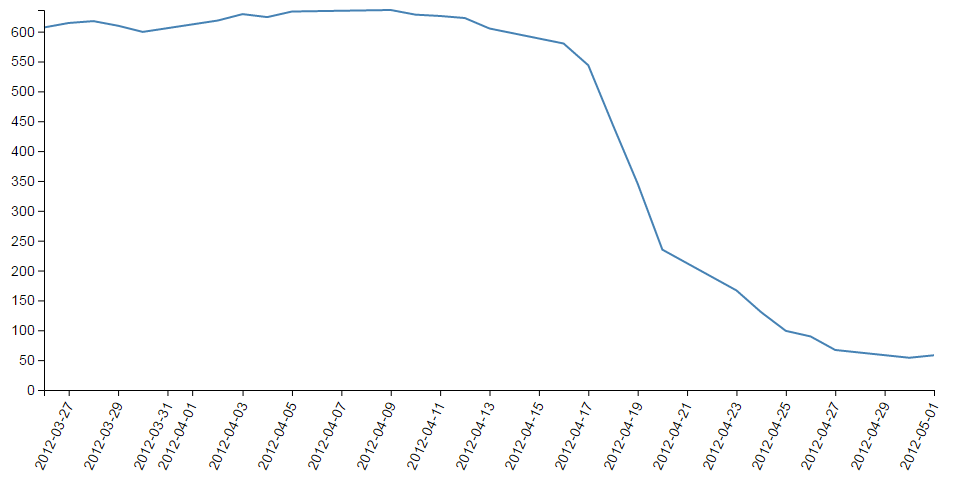
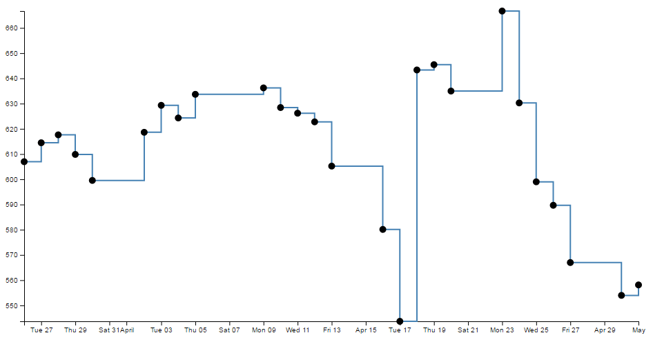
Now we shall address the other problem taht cropped up when we change the size of the text. We have overlapping values on the x axis.
The axis component includes a function to specify the number of ticks on an axis.
1 | svg.append('g') |
Here you may face a confusion:
When you specify ticks to 5 or 4, or 3, there’re always 5 ticks, and if you specify ticks to 2, the axis ticks will be 2 representing month.


This is because D3 is making a command decision for you as to how your ticks should be best displayed.
The following is the list of time interval that D3 will consider when setting automatic ticks on a time based aaxis:
1, 5, 15 and 30-second
1, 5, 15 and 30-minute
1, 3, 6 and 12-hour
1 and 2-day
1-week
1 and 3-month
1-year
You can specify custom time interval by d3.axisBottom(xScale).ticks(d3.timeDay.every(4)).
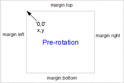
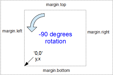
Rotating text labels for a graph size
An answer to the problem of overlapping axis values might to be rotate the text to provide more space.
1 | svg.append('g') |
Formatting a date / time axis with specified values
1 | svg.append('g') |
Adding Axis Labels
1 | // text label for the x axis |
Add y axis
1 | svg.append('text') |
Something may confused you:
And add the title…
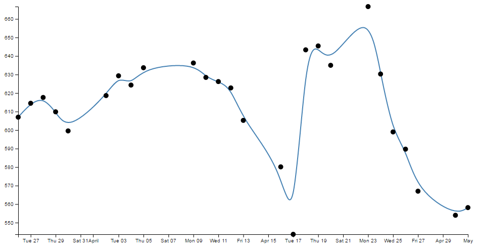
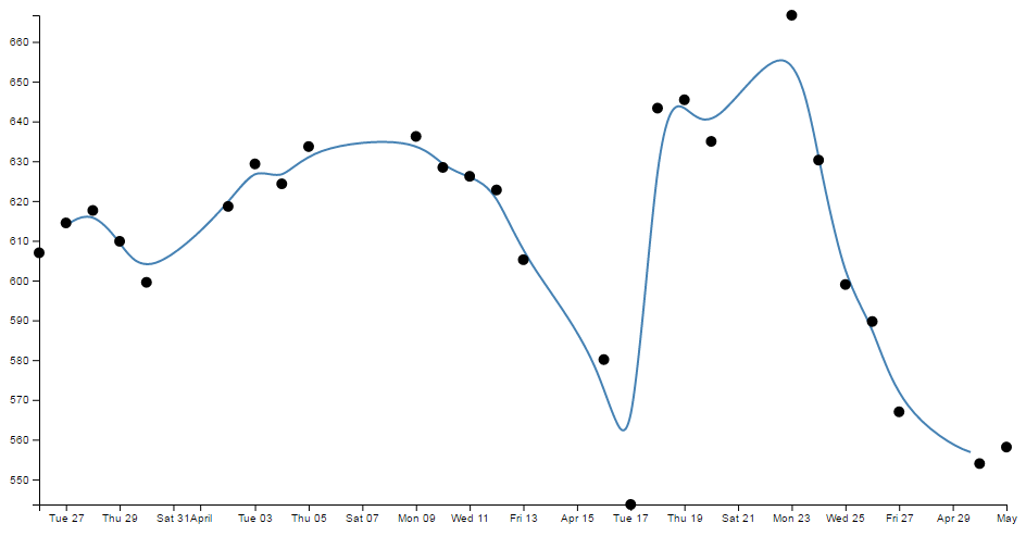
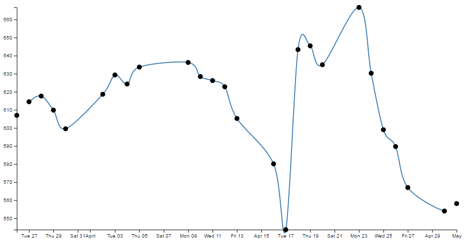
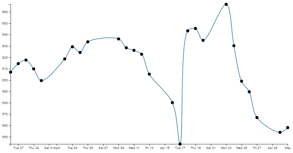
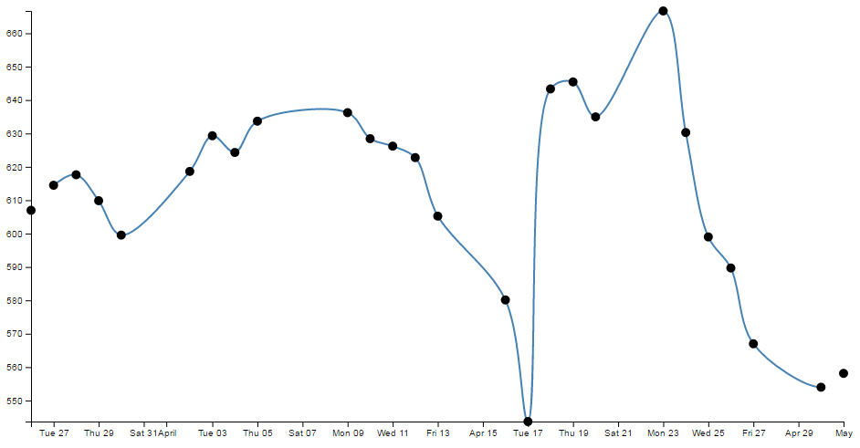
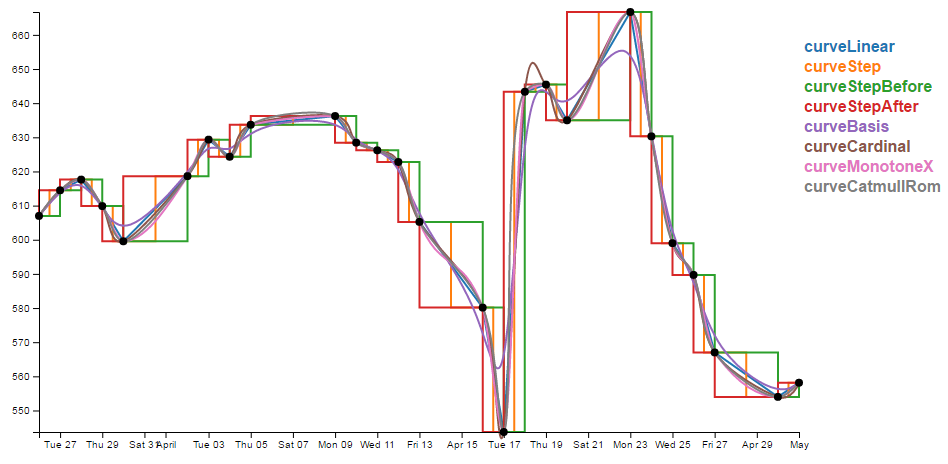
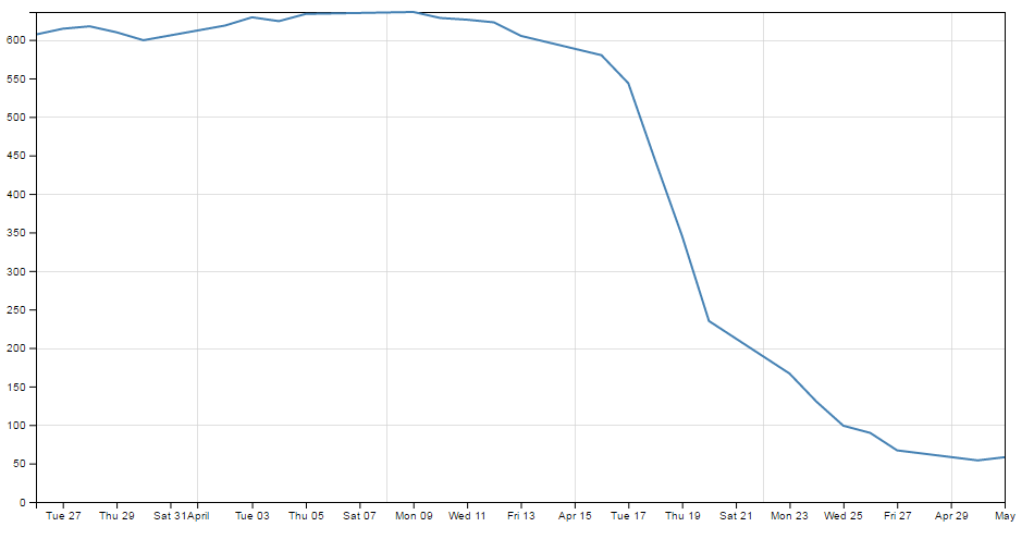
Smoothing out graph lines
1 | .curve(d3.curveBasis) |


Make a dashed line
1 | svg.append('path') |
Obviously stroke-dasharray is a style is a style for the path element, but the magic is the numbers.
Essentially they describe the on length and off length of the line. So '(3, 3)' translates to 3px on and 3px off.
You can try '5, 5, 5, 5, 5, 5, 10, 5, 10, 5, 10, 5'
Of course you can apply this style on axis or any where you prefer.
Filling an aera under the graph
Filling an area with a solid color isn’t too hard.
CSS for an area fill
1 | .area { |
Define the area function
1 | const area = d3.area() |
Draw the area
1 | svg.append('path') |
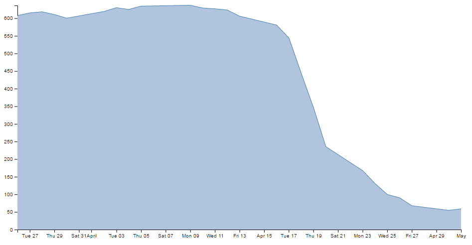
If you want to fill the area above the graph
1 | const area = d3.area() |
Add a drop shadow to allow text to stand out on graphics
1 | text.shadow { |
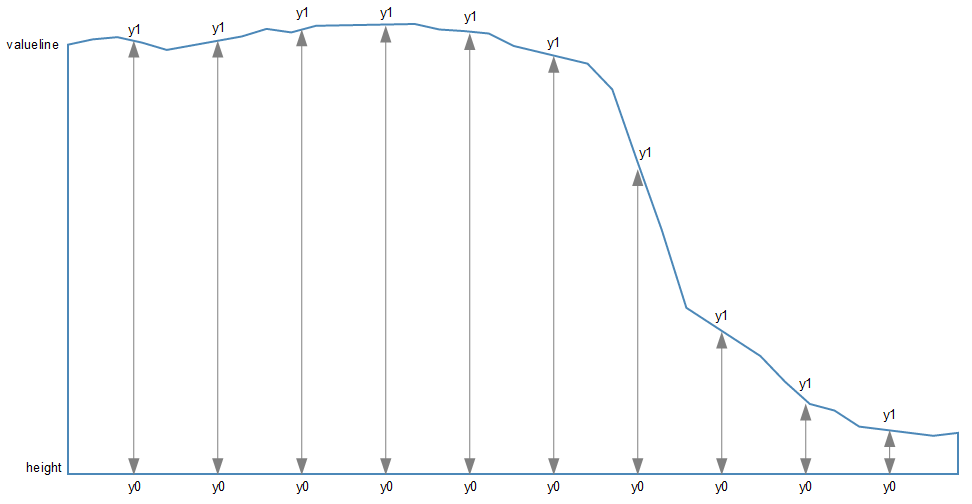
Add grid lines to a graph.
We are going to use the axis function to generate two more axis elements(one for x and one for y) but for these ones of drawing the main lines and the labels, we’re just going to draw the tick lines.
CSS
1 | .grid line { |
Here we use shape-rendering: crispEdges to make the lines narrow.
And set .grid path{ stroke-width: 0; } to dismiss line of top and right line, it will be like this if we remove the css style:
Define the grid line functions
1 | // gridlines in x axis function |
Draw the lines
1 | // add the x gridlines |
1 | axis.tickSize([size]) |
In our example, we are setting our ticks to a length that corresponding to the full height or width of the graph, which of course means that they extend across the graph and have the appearance of grid lines.
The last thing that is included in the code to draw the grid lines is the instruction to suppress printing any label for the ticks:
1 | .tickForamt('') |